Today has been a long, hard painful traveling day.
I didn't get any sleep last night, I've had little food, and I'm running on empty.
I've had a plane from Atlanta to Denver, from there to Salt Lake City, and I took a shuttle from there to Rexburg. I almost killed myself dragging roughly two hundred pounds of baggage across the country.
It's all over, though, and I'm here.
I worked in Photoshop while I waited for flights, etc.
I finally got a title I like, and I'll put it up as soon as I have internet again.
By the time I post this, it will be up.
I like my blog much better than before.
It was a pain to convert it's original reds and yellows to blues.
I have a better font than any that was available from blogger, so I used it instead.
For those of you with a good eye who've seen it, you'd recognize it as a clip from Fiery Collapse.
Showing posts with label photoshop. Show all posts
Showing posts with label photoshop. Show all posts
Thursday, April 16, 2009
Monday, April 13, 2009
Subscription and Bookmarking Images
Today I added the buttons for RSS, Delicious, Technorati, and Digg.
I had found the ones I wanted on the www, but they were in one image.
The only solution I could find was to manually separate them.
Hence, today's photoshop project.
What I had to do was right-click "layer via copy" the best selection I could muster, and then fill in the left out white areas on a layer behind them.
All but the RSS were missing corners. I selected a corner of them and transformed the selection over the missing corner, then filled it in with white behind, like I said.
It was a big pain, though I was clever enough to get through it without a ridiculous amount of effort.
For those of you that want to use non-square images on your own blog/websites, here's how it's done:
- You save it as .png, having transparency.
- You upload it wherever (I use Photobucket)
- You include it in the code whatever way you is easiest. Basically you'll use an <img> tag.
For more info on the <img> tag, see Here.
If you're doing this and have questions, don't hesitate to ask.
My artwork for today is already visible, so of course I'm not posting under "artwork".
Thursday, April 9, 2009
Overhaul! New Blog Theme
I spent ALL DAY yesterday coding my blog.
The thing's a nightmare to sit down and rearrange.
The Blogger code uses XHTML, JS, and other crap all inside CSS.
It's insane. No, it's a NIGHTMARE.
I spent forever trying to get my menu bar to work I'd previously given up on... Turns out, it was all Photobucket's fault.
With my luck, I'm not surprised.
I got it almost finished, and it's a lot nicer than before. What I decided was relatively simple: Use Moonlight Bestowal as a background. I made all of the other colors match, and I enjoy it. I wanted something watery and rainy for April, so I got it.
It's all blue! Blue is my favorite color... I could look at it all day...
The results are pleasing.
I wish the title area looked better, and I'll fix it, but not now. It's ok for this minute. When I find what I want I'll figure out how to put it there. I still am not sure...
I'm gradually changing the code, and it's becoming less and less restrictive. I remember back when I added my third column... that was a lot of fun. NOT.
Coding other people's code is annoying, no matter how carefully it's documented...
The Blogger theme I started with? Minima Black.
If you look at Marianne's Blog, Green Blue Purple, You'd see mine in it's early days, minus her ocean pic. I love her ocean pics, though...
Tuesday, April 7, 2009
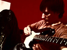
Photoshopping My Guitar
Once upon a time, back when I was a little childish artist, I used MS Paint to painfully crop out an image of my guitar. That day is long gone, and the data with it.
Luckily, the photo still survived... so...
 I went and PSed it. Isn't it wonderful?
I have my guitar at my disposal for anything I want to do with it.
Problem is, I'm not entirely sure what I want to do.
There's a mountain of potential, and I want to make use of it.
I've already played around with making custom brushes - I can make a million different colors and sizes and shapes of guitar randomly... I was being silly with that...
I'm just not 100% sure what my next piece of art will involve, and I don't know how to incorporate it. I'll have to think...
I can use just the outline for an abstract concept piece, and maybe warp it. Who knows...
Anyways, that's the latest project. I made a random monkey brush for my brother Bradley. He's a monkey nut. It's rather creepy to generate an possibly infinite number of smiling monkey faces.
I have two new brushes as of today... I wonder what I'll do next... I don't have anything big on the agenda. I still suck at typography, but I'm getting better... I may do some neat vector thing if I can find an inspiration.
I'm still trying to decide what to do for my blog for April...
Saturday, April 4, 2009
Turtle Soup
I have finally gone and finished mom's other book, Turtle Soup.
I'm not entirely sure what it will be about...
She wanted me to do it like I did The Privateer.

The resolution on the image she has for this is way smaller than the other... This one actually fits on the screen... I cut the size of the original Privateer in half, and it is still significantly bigger... strange...
Luckily, This one was much better quality.
Here's her piece about it from her website...
Sea turtles may be endangered but after an encounter with marine biologist, Jack Brandon, nothing will stop Sara Hart from naming her deli, Turtle Soup. When Jack takes a job at the nearby Georgia Aquarium, Sara finds the environmental poster boy at her door, hungry and carrying a chip on his shoulder. Neither thinks the other has what it takes, until a scuba class reveals what lies beneath the surface. It will take food, friends, and a little help from Mother Nature, to help them see that making a difference isn’t all numbers and glory. It must begin with love.
I did it basically the same way I did the other...
 I love the gradient I found for this...
I took the one from Happy To See You and I shifted the hue down halfway toward green and orange.
If you're curious about the method, it's relatively the same, so see The Privateer.
I must note, though, that moving the text to the spine was way harder, particularly the title.
I had to sit and rub with a tiny clone stamp, brush, and eraser for ages after I used select>color range... Where it touches the turtle, the colors are too close and it gets nasty.
I had to modify the spine lots, too. I couldn't just stretch the edge of the image. I did, but I had to battle hair and turtle to make them the right color, and make it all shades of green.
I love this one... I'm proud of it. I think I'm getting better.
Wednesday, April 1, 2009
Moonlight Bestowal
That's the name of my most recent piece.
It's a beauty, but it needs something... I don't know what...
Anyway, here it is.
 I think it's one of the better ones I've done in some time. The name was spontaneous after I added the last touch - the moon. It is a wave of the sea tossing in the pouring rain on a stormy night. The foam glows in a surreal manner in the narrow stream of moonlight. It's very... poetic?
It's a theme that has always followed much of my music and poetry composition. It's rather strange to me to find that this is the best rain result so far. There's almost a little bit of irony to it - I was looking for something unique, and the uniqueness came out of a cliché of mine. Huh.
The rain was done by brushes of my own design. My ideas were heavily taken from this tutorial.
Aside that rain work, it was all purely mine. My personal brushes made the bubbles and the streamlines are standard-brush pen tool work. The bubble silhouettes on the right are my own gradient+circular selection idea. I used cloud/difference cloud filters, and I set lots of layers' blending to "soft light".
Sunday, March 29, 2009
Water Drop Attempt
I haven't had time to figure out what I wanted...
It seems like the only good ways to do water are with a camera.

This is a piece of practice... I almost didn't show it. I am trying to learn to do cool water... this is comparatively lame.
It's not too bad, though. I'm learning, at least. The basics are layer styles. They are the easiest way to imitate water.
There are a large number of tutorials I've collected that I haven't had time to to that are worth a look.
Two significant ones are:
Water from a tap
Dark Rain - my favorite
These are out of 40 Tutorials I found a list of.
I hope to do SOMETHING april-themed... just dunno what.
NO EASTER EGGS. Sorry. I'm putting my foot down.
What do you think I should do? I'm saving flowers for spring.
Thursday, March 26, 2009
Struggling with Raindrops
Today I worked to come up with some kind of neat water/rain effect art in Photoshop.
That's what I wanted to discuss today...
Unfortunately, I failed miserably.
I did a few, but it's not what I want.
So I've decided there'll be a take-two on this. I'll show you some once i've had success.
Making a cheap water drop style in photoshop is easy, though.
If you draw something on a layer, and turn the fill to 0% instead of the opacity, only the layer style will show through. Do that, and use inner shadow, outer shadow, and bevel&emboss correctly, and water is actually very straightforward.
I will be more particular on the particulars, so to speak, once I get something productive finished.
Until then, I'll have to drown in clover... I really want to do a "rain" art piece, for April, though.
Monday, March 23, 2009
Photoshopping From Scratch: Starry Scene
I did a from-scratch (i.e. "real") piece of digital art the other day from that night sky tutorial I mentioned a little while ago. It took FOREVER.
I'm kinda burned out now.
Here's what the tutorial showed:
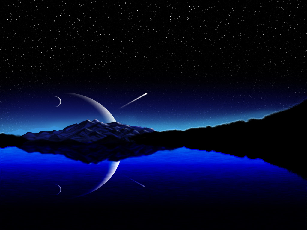 This is the one that I was supposed to imitate. Considering I did my own thing, not attempting to follow fully, I think in some respects I did a better job.
I do think he did better with the mountains, but mine aren't to shabby, considering the level of difficulty. If you go and look at the actual images, the resolution is different. His is only 1024x768 (4:3), and mine is 1440x900 (8:5/widescreen).
This is mine. His is "Night Sky". This I call Starry Scene. Unfortunately, the stars don't show out in this scaled-down image. I think you can click on it to see the full-size.
 There are all kinds of differences. I added a displacement map for the water, which makes mine appear more realistic close-up, imho.
I thought his stars were a little rough, so mine are softer.
I like the elements in mine being more centered. Plus, his light-blue distant mountains seemed kinda fake - I faded mine - I almost removed them completely. My glow is lower, too.
Also, I colored the tree edges green, so on closer inspection you'd see that it's not just a black smudge - they are tree branches.
...
My mom's about to get a lot of website attention, and someone else wants to sell her book, thinking the image I did was of a real book! Well, They're a normally only-print company, and are making an exception in her case. I guess they like my pic!
Well, as her radio interview comes out the 7th, She wants me to help with a website tweak, as well as do the same for Turtle Soup that comes out in August that I did with The Privateer.
I'm excited to help. At least somone's cashing in on my ability...
I'm kinda burned out now.
Here's what the tutorial showed:
This is the one that I was supposed to imitate. Considering I did my own thing, not attempting to follow fully, I think in some respects I did a better job.I do think he did better with the mountains, but mine aren't to shabby, considering the level of difficulty. If you go and look at the actual images, the resolution is different. His is only 1024x768 (4:3), and mine is 1440x900 (8:5/widescreen).
This is mine. His is "Night Sky". This I call Starry Scene. Unfortunately, the stars don't show out in this scaled-down image. I think you can click on it to see the full-size.
 There are all kinds of differences. I added a displacement map for the water, which makes mine appear more realistic close-up, imho.
I thought his stars were a little rough, so mine are softer.
I like the elements in mine being more centered. Plus, his light-blue distant mountains seemed kinda fake - I faded mine - I almost removed them completely. My glow is lower, too.
Also, I colored the tree edges green, so on closer inspection you'd see that it's not just a black smudge - they are tree branches.
...
My mom's about to get a lot of website attention, and someone else wants to sell her book, thinking the image I did was of a real book! Well, They're a normally only-print company, and are making an exception in her case. I guess they like my pic!
Well, as her radio interview comes out the 7th, She wants me to help with a website tweak, as well as do the same for Turtle Soup that comes out in August that I did with The Privateer.
I'm excited to help. At least somone's cashing in on my ability...
Friday, March 20, 2009
Doing a Book (In PhotoShop)
Well, My mom has a book she's published coming out soon, and it's being sold online as an e-book, maybe/maybe not in print later.
For those interested in the book itself, it's about 18th century naval battles, I think. I haven't read it yet, but I hope to soon. It sounds pretty good. It comes out April 17th. You can find more at my link "mom's books" to the left, or just click here.
She wanted me to do an illustration of a book for it, rather than just the flat image someone threw together for her as a cover.
This is it.

I honestly had a moment of frustration when I first saw it way back when. I could have done a better job than whoever she paid to, had I had a source photo of such a boat. I just didn't help her because I didn't know where to find one.
I could do better water, better clouds, better lighting... It's not that bad, though. Still... I feel kinda dumb. I need to get better at finding source pics.
Here is my book. Or her book. Or whatever.
This isn't one she's using, but it's my presentation of it. She preferred a plain white background.

What I did was use free transform to give perspective. I moved a duplicate right and down once, then duplicated that a couple times with ctrl+alt+shift+T on the same layer. That made a front cover, with thickness.
I duplicated all of that and moved it left and up to be the back cover.
Then I used the single-column marquee tool to select the edge of the front and transformed it to make the spine. I put a low-opacity fill over it to make the spine different and darker and less striped from the stretch.
I copied the text from the original with color select, and used it on the spine via transform.
The pages was the tricky part. I finally ended up deciding to just do a carefully crafted white shape. I cut triangles out along the back page corners. You can't see it in this scaled-down image.
Last, I played. I found a nice gradient, I did a reflection, and I added mild shadows and lighting. I think it's a job well done!
Tuesday, March 17, 2009
BubbleWorks
'BubbleWorks' ...
is the name of my newest art piece. It looks better full-size, as usual, but For what you already see it's not too bad. It was fun. More of a toy than a piece of art.
 I didn't learn anything. I hated the tutorial. It was one of the ones I listed yesterday. Another one was dumb, too. I didn't even try it.
I have two left to look at, and if they're worth what they appear to be, I'll have something to show next time. We'll see.
Anyways, the things I covered in this were tricks like inventing a layer style and copy-pasting it to multiple layers. You'd be surprised how much spice that can add without significant effort. It all adds up pretty quick. I played with designing my own brushes for it. Nothing significant, though.
One thing I did learn significant today, however, is that you can make a shape with selections, and modify them, especially with free transform. Then you can fill them with a color, a gradient, and add layer styles to your heart's content!
Using layer styles and old/plain brushes often feels like cheating. It can do wonderful things, but it's easier to be proud of your work when it's your concept or creation. My Feeling Lucky Four-leaf clover (and background brush) were all from stuff I did myself with the pen tool. I can credit it all to my own idea. I'm proud of that one. I did good. If you're ever doing art you want to have value, at least to you, keep that in mind.
Friday, March 13, 2009
Photoshop Finds
Couldn't find anything worth doing until late this evening, so I'm writing this late and don't have time do anything.
I'm excited, though - I have bunches of things I want to try.
At psd|tuts+ there's a neat tutorial I want to emulate with my own stock photography here.
There's a place called eyesontutorials that has these two tuts I want to try - they're abstract art, but still... I like that kind of thing. One's called Digital Life, and the other Color Variations.
The fourth one is a beautiful illustration at AdobeTutorialz, called Night Sky.
This will be the centerpiece for a work I'll do in the future - I like it a lot.
More importantly, if I can do it, I can do it better.
Not to be arrogant, but if I see something I might outdo, I like to accept the challenge.
To me, that's part of learning. Sometimes I win, sometimes I lose. I learn either way.
Well, I hope to have something cool next time folks. We'll see...
Tuesday, March 10, 2009
Feeling Lucky?
That's actually the name of a piece I did for March.
I drew a clover from scratch and made it into a brush.
Voilá!
 I love it. I may even use it as my background to my blog at some point.
I took the brush I made and played with the dynamics.
I made several scatters with gradually more and more blurred with low opacity toward the bottom. The result is a slight depth of field... It has depth. It's probably one of the shortest works I've done in a while, and considering how much I like it, it was far worth it.
In other news, Rob is a pen-tool PRO! Who knew I could do something so beautiful so easily. My drawing abilities leave a lot to be desired, but they do occasionally come through when I actually use them.
I think I should have put an outer glow on the main clover. I probably will at a later date - it would look much better that way.
Saturday, March 7, 2009
Photoshop Issues and a Tip
I haven't got much done lately, as my PS has been issue-ey.
Well, I would love to have something to show, but unfortunately I don't.
Well, actually I do. There's a pseudo-tutorial Here that discusses how to keep the file size on a .psd down. That's always helpful, because anyone who works in PS as much as I do would know how much of a pain it is to have enormous files. they're hard to move, massive folders take ages to open, etc.
So my life is made easier by the internet once again... if only marginally.
I found a neat transparent glass tutorial for text, if anyone wants to see it.
I've noticed PSDtuts has changed, as their series of websites has become tuts+. so now it's
psd | tuts+
I like the feel a bit better. I use their site vector | tuts+ for Illustrator.
Hopefully I'll have a pic to show you next time around. Until tomorrow, folks.
***March 18
I left my laptop for a long time - though my life still goes on. I have a pile of posts to put up. I'll put up several a day till it's live. Sorry for the backup - to those of you who actually care.
Thursday, March 5, 2009
Been Kept Away... but Happy!
My parents had to go to Las Vegas for a writer's convention and with me and my brothers left here at home, we're not on allowed on the internet until Stacy&Thomas get here... so it means I won't be on the internet for a few days... this will be late... poo.
Anyways, I did some artwork I hadn't had ready to show till now.
It's Happy to See You.
 I have been meaning to look into the minimalist art or whatever they call it... where there's just a simple subject. Playing with a tutorial that looked both important and annoying, I decided to make a smiley face in ridicule of the aforementioned tutorial. It came out so much better than I expected I made it into it's own little slice of art. The back gradient took forever - I was toying with colors for ages. I finally settled on white, light yellow-green, a light cyan, and a medium sky blue.
I like it. I put it as my desktop wallpaper temporarily. How many works of art can be described so well by as little as two characters? :)
Monday, March 2, 2009
Incoming!!! New Artwork
I have a lot of new stuff I've spit out since last time... I can't even show it all now... I'm saving some for next time!
First off... Fiery Collapse
 This one is my first attempt at artwork using zoom and spin in (filter, blur) radial blur. It is almost a concept piece in that respect. I like it - to me it's matter approaching the event horizon of a black hole. Nobody knows what happens once it's beyond that line. Not even light can escape it, so once info or material goes in, nothing comes out - there's no way to know. As things are squished with near infinite force, the temperatures generated are ridiculous. That's why my colors of choice were red, yellow and white.
This one is called Vector Exit
 I like this one probably the most out of the three. It's arrows and bubbles fleeing toward the horizon. Toward what? From what? that's for you to decide. It was all transform - perspective that did it - unfortunately I had to battle against quality loss.
It has almost a sci-fi feel to it - like it's some white room opening into outer space. Life is like that; you're sucked into the future whether you like it or not.
This is Positive Influx
I did this one similar to the first, but there was a lot more play to it. I added colors on a top color-mode layer with a soft low-opacity brush. It's the energy flowing through the electrons in an electric cord of some kind. It started as an attempt to make my own brushes, which had a give-a-mouse-a-cookie effect... one experiment led to another until I did a whole image. I originally hadn't planned on doing anything else today, what with the other two and all.
Like I said, more next time... That's Thursday, I think.
First off... Fiery Collapse
 This one is my first attempt at artwork using zoom and spin in (filter, blur) radial blur. It is almost a concept piece in that respect. I like it - to me it's matter approaching the event horizon of a black hole. Nobody knows what happens once it's beyond that line. Not even light can escape it, so once info or material goes in, nothing comes out - there's no way to know. As things are squished with near infinite force, the temperatures generated are ridiculous. That's why my colors of choice were red, yellow and white.
This one is called Vector Exit
 I like this one probably the most out of the three. It's arrows and bubbles fleeing toward the horizon. Toward what? From what? that's for you to decide. It was all transform - perspective that did it - unfortunately I had to battle against quality loss.
It has almost a sci-fi feel to it - like it's some white room opening into outer space. Life is like that; you're sucked into the future whether you like it or not.
This is Positive Influx

I did this one similar to the first, but there was a lot more play to it. I added colors on a top color-mode layer with a soft low-opacity brush. It's the energy flowing through the electrons in an electric cord of some kind. It started as an attempt to make my own brushes, which had a give-a-mouse-a-cookie effect... one experiment led to another until I did a whole image. I originally hadn't planned on doing anything else today, what with the other two and all.
Like I said, more next time... That's Thursday, I think.
Friday, February 27, 2009
Having Fun Again ! Pomp-Tuition!
Today I did something in Photoshop.... something FUN!
I usually get impatient and annoyed - I was getting a little impatient with this one, but I'm done.
I'm glad to be back in the PS department.
It's called Pomp-Tuition.
 It's from a tutorial I did off a PS-Roadmap link. I like the process - though I messed up the lighting at the end. I need to go back and see if I can fix it, maybe do it again better.
It taught that if you play with Layer Styles and get a neat one, you can copy+paste it on several different things. It was all actual characters that were rotated and placed. Most of the layers were text layers. It's not a fancy font - just something plain, blown up large, with layer styles of inner shadow, outer glow, and bevel/emboss.
The font was Georgia, by the way... and the streaks/ribbons were done simply with the pen tool.
I liked it! I hope to do something much better next time around.
Tuesday, February 24, 2009
The V-Day Equivalent
Today I got to spend time with Sarah, finally.
We ended up watching a movie with her little brothers.
It was that Jack Black "Kung-fu Panda" movie. It was better than I thought it'd be.
We played with their parakeet, Bobby - her brother Eric keeps it these days, and was out of town at the time or something - they were keeping it for him.
We had a lot of fun. I have missed spending time with her greatly.
With all that's been going on, I haven't had the luxury of time on my laptop these days.
My Eagle Court of Honor thing is tomorrow and there's stuff to be stressed about.
I spent most of the morning going running today.
I need to get back into shape - exercise is important, especially as we're approaching summer.
I hope to get back to Photoshop as soon as possible.
I'm loaded up on Photoshop to-do, ideas, tutorials, etc.
For those of you looking for my usual artwork, I'll have something next time, I promise.
In the mean time, you could take a look at some of these - they're from some of the best.
http://www.artistsofphotoshop.com/
Friday, February 20, 2009
Saturday Tutorializing : Energy Curves
Today I just dug through some tutorials.
I have a mountain of illustrator ones, always more photoshop ones, and I've burned myself out on attention span.
Maybe in a few weeks I'll take them seriously.
I have too many things occupying me to deal with such unimportant life tasks.
Today's piece is called Energy Curves.
 I have taken my time on this one, mainly because it's a simple one that left me rather confused.
I finally figured out a principle related to layers and "clipping masks". Layers apply to all the ones below them, but you can get them to only apply to a certain one. The colors were applied over top the lines as clipping masks. this way, I could put whatever I want in the back without worrying about color spillage onto it
(this would cause a "glow look" even if done well).
In the end, I actually decided to put similar colors in the back, so it didn't matter so much. It could have, though, if say I wanted the back blue or yellow or purple.
I think it turned out ok. It's nothing incredible, but it's good considering I haven't had the emotional energy to accomplish more. I like the stars... they were a last-min addin.
The inspiration tutorial is HERE. I think his/her end result looks like crap, tho. Mine's better. I feel a little guilty saying that - Seeing as it gave me the idea.
Tuesday, February 17, 2009
Illustrator Tutorials
I've been loaded up with so many Illustrator tutorials it's not funny.
I've got hypertext coming out of my ears.
There's way too much for me to look at, and it's driving me nuts. I've got a lot to sort through.
I did run into the companion site to PSDTuts for Illustrator, VectorTuts.
You can find VectorTuts HERE, for those interested.
Lee, by the way, I'm curious to know what you have to say.
I haven't asked you about illustrator. I'm sure you could show me something - you know more than I do.
I've even found links to tutorials that use both Photoshop and Illustrator, like the ones HERE at VandelayDesign
I may put out a list of everything in some post, even if it's only for my own reference.
Yep. I actually post things for me to read sometimes. Sad, huh?
Subscribe to:
Posts (Atom)